[discrete]
v8.0.5
Introduction
DOT Web Document Auto Capture is set of non-ui-component and ui-component web components to capture image of an ID document.
non-ui-component is a web component that renders the video stream from an available phone or web camera to automatically capture an image of an ID document with the required quality.
ui-component is a web component that renders an overlay over video stream. Overlay includes a placeholder, camera control buttons and instructions to guide the user to position the document correctly.
[[supported-browsers]]
Supported Browsers
DOT Web Document Auto Capture was tested with:
- Chrome on desktop (Windows, Mac and Linux) and mobile (Android, iPhone)
- @Deprecated Firefox on desktop (Windows, Mac and Linux) and mobile (Android)****
- Edge on Windows
- Safari on Mac, iPad and iPhone
- WebView on Android*
- SafariVC on iPad and iPhone**
- WKWebView on iPad and iPhone***
Known issues:
*{sp}Some older Android phones can experience issues with camera stream initialization using WebRTC. Our web components will work on most of them, but camera stream could be slow and laggy. This issue is caused by device and can be experienced in any website using WebRTC in Android WebView.
**{sp}Components are tested with SafariVC on devices iPhone 7 and newer with iOS 15 or iPadOS 15 or newer. Older devices or iOS versions are not officially supported and might experience issues.
*** In order to run DOT Web Document Auto Capture in WKWebView on iPhone or iPad, allowsInlineMediaPlayback and mediaTypesRequiringUserActionForPlayback properties on WKWebViewConfiguration must be set to true.
****{sp} @Deprecated Firefox support for all Innovatrics web components is deprecated and will be discontinued in next major release.
Some older and/or low-end Android phones can experience issues with camera stream initialization using WebRTC when using Firefox browser. Our web components might display The webcam is already in use by another application error. This issue is caused by the Firefox's implementation of initialization of camera and can be experienced in any website using WebRTC in Firefox on Android. It is recommended to use other supported browsers in those cases.
When using components on MacOS with linked iPhone (using Apple ID) and enabled Continuity Camera setting, the camera stream from the iPhone might not get streamed correctly in the case user has an active Firewall protection from third-party Antivirus software.
When using components on Safari on MacOS with linked iPhone (using Apple ID) and enabled Continuity Camera setting, there may be multiple cameras present, which might not work as expected. Switching camera until correct camera is selected fixes the issue.
Video capture feature is not supported in Firefox for Android and Safari (and WebView) older than 16.4.
Privacy and security
This component can only be used in secure contexts due to MediaDevices API used for handling camera access. A secure context is, in short, a page loaded using HTTPS or the file:/// URL scheme, or a page loaded from localhost. Before accessing any camera, the component must always get the user's permission. Browsers may offer a once-per-domain permission feature, but they must ask at least the first time, and the user has to specifically grant ongoing permission if they choose to do so. Browsers are required to display an indicator that shows that a camera or microphone is in use. More details can be found on https://developer.mozilla.org/en-US/docs/Web/API/MediaDevices/getUserMedia#privacy_and_security[MDN docs^].
[[non-ui-component]]
Non-ui component
Requirements
Minimum required camera resolution for appropriate results is 720x720. Anything less is insufficient.
Initialization
DOT Web Document Auto Capture can be installed via NPM, yarn or pnpm
npm install @innovatrics/dot-document-auto-capture
To manually integrate the DOT Web Document Auto Capture, download latest version from the https://github.com/innovatrics/dot-js-kit/releases[Github repository^]. Add following line to dependencies in your package.json:
"dependencies": {
    "@innovatrics/dot-document-auto-capture": "file:innovatrics-dot-document-auto-capture-[VERSION].tgz",
}
where [VERSION] is the DOT Web Document Auto Capture version integrated. This installs dot-document-auto-capture as an external module that can be use then (just like any other module in the code) For example, one could do import '@innovatrics/dot-document-auto-capture'; in the app.
Usage
Document auto capture component is a https://developer.mozilla.org/en-US/docs/Web/Web_Components/Using_custom_elements[web component] which uses custom HTML <x-dot-document-auto-capture/> tag.
Properties configuration needs to be passed into component after <x-dot-document-auto-capture/> tag was rendered.
To see an example of using the component together with ui-component, see example-of-using-components-together.
import type {
  HTMLDocumentCaptureElement,
  DocumentConfiguration,
  CallbackImage,
  DetectedDocument
} from "@innovatrics/dot-document-auto-capture";

import { useEffect } from "react";
import "@innovatrics/dot-document-auto-capture";

function DocumentCamera(configuration: DocumentConfiguration) {
  useEffect(() => {
    const documentAutoCaptureHTMLElement = document.getElementById(
      "x-dot-document-auto-capture"
    ) as HTMLDocumentCaptureElement | null;

    if (documentAutoCaptureHTMLElement) {
      documentAutoCaptureHTMLElement.configuration = configuration;
    }
  });

  return <x-dot-document-auto-capture id="x-dot-document-auto-capture" />;
}

function Page() {
  function handleOnComplete(imageData: CallbackImage<DetectedDocument>, content: Uint8Array) {
    // ...
  }

  function handleError(error: Error) {
    alert(error);
  }

  return (
    <DocumentCamera
      camera={{ facingMode: "environment" }}
      autoCapture={{
        candidateSelectionDurationMillis: 3000,
      }}
      onComplete={handleOnComplete}
      onError={handleError}
      sessionToken="1111-222-333-4444"
      transactionCountingToken="provide-the-token-here"
    />
  );
}
Alternatively, you can use useRef and useLayoutEffect to render a web component with its props.
import type {
  DocumentConfiguration,
  HTMLDocumentCaptureElement,
} from '@innovatrics/dot-document-auto-capture';

import { useLayoutEffect, useRef } from 'react';
import '@innovatrics/dot-document-auto-capture';

function DocumentCamera(configuration: DocumentConfiguration) {
  const ref = useRef<HTMLDocumentCaptureElement | null>(null);

  useLayoutEffect(() => {
    const element = ref.current;

    if (element) {
      element.configuration = configuration;
    }
  }, [configuration]);

  return <x-dot-document-auto-capture id="x-dot-document-auto-capture" ref={ref} />;
}
TypeScript
Declaration file is bundled inside package. To use with TypeScript, import types from @innovatrics/dot-document-auto-capture.
import type { DocumentConfiguration, CallbackImage, DetectedDocument } from "@innovatrics/dot-document-auto-capture";
Hosting dot-assets files
During the initialization phase of the component, the component loads the required assets files, such as WASM binary files, javascript chunks, license etc, via HTTP fetch request. Please note that we do not provide any hosting for those files. That's why it is essential that the customer provides the component with all files from our distribution. To do so, please:
-
copy
dot-assetsdirectory from our distribution into your distribution every time you update to new version of the component. If you are using package manager, you can finddot-assetsdirectory innode_modules/@innovatrics/dot-document-auto-capture/dot-assets. -
copy
iengine.lic(orlicense.lic) file intodot-assetsfolder in your distribution.
Please note that dot-assets files need to be hosted at the same URL as your app - https://developer.mozilla.org/en-US/docs/Web/API/Worker/Worker#:~:text=This%20script%20must%20obey%20the%20same%2Dorigin%20policy.[same-origin^]. Because of that, we do not recommend using any CDN, as it will probably not function properly.
Structure of the directory in our distribution
@innovatrics/
|__ dot-document-auto-capture/
    |__ dot-assets/ <-- copy this directory
        |__ document/
            |__ wasm/
                |-- sam.wasm
                |-- sam_simd.wasm
            |-- dot-<CHUNK_HASH>.js
            ...
        |__ wasm/
            |-- acp_core_wasm_bg.wasm
    |-- package.json
    |-- README.md
    ...
Example of the dot-asset dir structure in integrator's application
public/
  |__ dot-assets/ <-- do not change the name or structure of this directory (only add folders for another components when needed)
      |__ document/
          |__ wasm/
              |-- sam.wasm
              |-- sam_simd.wasm
          |-- dot-<CHUNK_HASH1>.js
          |-- dot-<CHUNK_HASH2>.js
          ...
      ... <-- if you are using other components (e.g. face), the folders with assets of these components will be here (eg. face/)
      |__ wasm/
          |-- acp_core_wasm_bg.wasm
      |-- iengine.lic
  ...
By default, the component will try to fetch the desired files from <PROJECT_ORIGIN>/dot-assets/**. This can be changed using assetsDirectoryPath property. For example, if assetsDirectoryPath=/my-directory property is provided, the component will try to fetch the desired files from <PROJECT_ORIGIN>/my-directory/dot-assets/**.
Please note that structure and the name of the directory must be preserved.
For more information, check out our https://github.com/innovatrics/dot-web-samples[samples on Github] where you can find real examples of how to host files in various technologies such as React, Angular, Vue, etc.
Please note, that if you use multiple components (e.g. document and face) you need to make sure, that all of the needed files are present in appropriate folders:
public/
  |__ dot-assets/ <-- do not change the name or structure of this directory (only add folders for another components when needed)
      |__ document/ <-- copied from @innovatrics/dot-document-auto-capture
          |__ wasm/
              |-- sam.wasm
              |-- sam_simd.wasm
          |-- dot-<CHUNK_HASH1>.js
          |-- dot-<CHUNK_HASH2>.js
      |__ another_component/ <-- copied from another components' node_modules
          |__ wasm/
              |-- sam.wasm
              |-- sam_simd.wasm
          |-- dot-<CHUNK_HASH1>.js
          |-- dot-<CHUNK_HASH2>.js
      ...
  ...
Troubleshooting
If you are having difficulties with hosting wasm files, check your browser console in dev tools. You should see an error message with more details about the problem. It's also a good idea to look at the network tab in the developer tools and check that the wasm file has been loaded correctly. Please pay close attention to the actual response of the wasm load request, as an HTTP 200 status does not necessarily mean that the wasm file was loaded correctly. If you see application/wasm in response type, then wasm file was loaded correctly. If you see e.g. text/html in response type, then wasm file was not loaded correctly.
Licensing
In order to support wide adoption of the components, a free mode was developed in addition to the premium mode used by licensed customers.
Free mode
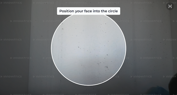
Components run in the free mode by default. This mode does not impose any feature limits, it just displays an watermark overlay over the component, to indicate not-licensed deployment. The overlay looks as on the image below:
Premium
To run components in premium mode, acp_core_wasm_bg.wasm and valid license files are needed. Additionally, if transaction reporting is enabled, a valid transaction token needs to be provided as a property (see transactionCountingToken in properties).
To initialize WASM binary file please follow a steps in [Hosting WASM files](#Hosting WASM files).
To use your license file you need to copy it to project public directory within dot-assets directory as <PROJECT_ORIGIN>/dot-assets/iengine.lic.
By default, the component will try to fetch the desired license file from <PROJECT_ORIGIN>/dot-assets/iengine.lic or <PROJECT_ORIGIN>/dot-assets/license.lic*. This can be changed using assetsDirectoryPath property.
*{sp}Please note that fetching license from <PROJECT_ORIGIN>/dot-assets/license.lic by default is deprecated and will be removed in future versions. Please use <PROJECT_ORIGIN>/dot-assets/iengine.lic instead.
If one of the following steps fails, then component will run in Freemium mode:
- WASM binary file not found
- license file not found
- license is not valid
- transaction token is not valid or provided (if transaction reporting is enabled)
In order to obtain the license (and/or transaction token), please contact your Innovatrics’ representative.
[[properties]]
Properties
- (Optional)
object camera- Camera configuration- (Optional)
[false]boolean isVideoCaptureEnabled– Enables video capture feature. Works only with https://developers.innovatrics.com/digital-onboarding/technical/remote/dot-dis/latest/documentation/[DOT Digital Identity Service^]. When enabled, component captures the last 8 seconds of the camera stream before the moment of capture. Check supported-browsers for details about the limitations regarding browser support. The captured video is bundled into the component’s result binary content and can be retrieved via the Digital Identity Service (DIS) for the purposes of https://developers.innovatrics.com/digital-onboarding/docs/functionalities/trust/identity-proofing/[Identity proofing]. - (Optional)
string facingMode– Defines which camera to acquire from browser's getUserMedia API. Default camera facing for mobile phones is set toenvironmentand for others platforms is set touser'user'– The video source is facing toward the user; this is the selfie or front-facing camera on a smartphone'environment'– The video source is facing away from the user, thereby viewing their environment; this is the back camera on a smartphone
- (Optional)
function onComplete– Callback on successful image capture(image, data) => void- (see callback-params)
function onError– Callback for the case that an error occurred (see handling-errors)(e: Error) => void
- (Optional)
string assetsDirectoryPath- Path to thedot-assetsdirectory - (Optional)
string sessionToken– Unique identifier of the session - (Optional)
string transactionCountingToken– Unique identifier for the transaction counting feature - (Optional)
object autoCapture- Auto capture configuration- (Optional)
[2000]number candidateSelectionDurationMillis- Duration of the candidate selection phase in milliseconds
- (Optional)
- (Optional)
object qualityAttributeThresholds- Detection configuration- (Optional)
object confidence- Detection confidence threshold- (Optional)
number min- Minimum confidence threshold
- (Optional)
- (Optional)
object sharpness- Sharpness configuration- (Optional)
number min- Minimum sharpness threshold
- (Optional)
- (Optional)
object brightness- Brightness configuration- (Optional)
number min- Minimum brightness threshold - (Optional)
number max- Maximum brightness threshold
- (Optional)
- (optional)
object edgeDistanceToImageShorterSideRatio- Edge distance configuration- (Optional)
number min- Minimum edge distance threshold
- (Optional)
- (Optional)
object hotspotsScore- Hotspots score configuration- (Optional)
number max- Maximum hotspots score threshold
- (Optional)
- (Optional)
object size- Document size configuration- (Optional)
number min- Minimum document size threshold
- (Optional)
- (Optional)
- (Optional)
HTMLElement styleTarget- Provide an alternate DOM node to inject styles. DOM node has to exist inside DOM before auto-capture component is initialized. This is useful when rendering components in a shadow DOM. By default, the styles are injected into the<head>element of the document. See style-target example for more details. - (Optional)
['AUTO_CAPTURE']captureMode- Defines a strategy for how a detection captures the desired image'AUTO_CAPTURE'- It is a standard way of how a detection captures an image. See capture-mode:auto-capture'WAIT_FOR_REQUEST'- Detection waits for request to capture an image. See capture-mode:wait-for-request
[[callback-params]]
Callback parameters
object imageDataBlob image– Returned image on successful capture injpegformatobject dataobject detection- Object contains all detection parameters and its values. Present if image was taken using auto capture (not manual capture).object imageResolution- Width and height of the captured image.
Uint8Array content- output for https://developers.innovatrics.com/digital-onboarding/technical/remote/dot-dis/latest/documentation/[DOT Digital Identity Service^]. Learn more https://developers.innovatrics.com/digital-onboarding/docs/functionalities/security/video-injection/[here]
[[thresholds-presets]]
Thresholds presets
DOT Web Document Auto Capture uses multiple thresholds presets for detection configuration based on different conditions. Currently, there are two presets:
MOBILE - Thresholds for mobile devices
- confidence
- min:
0.9
- min:
- sharpness
- min:
0.25
- min:
- brightness
- min:
0.2 - max:
0.85
- min:
- edgeDistanceToImageShorterSideRatio
- min:
0.05
- min:
- hotspotsScore
- max:
0.008
- max:
- size
- min:
0.43
- min:
DESKTOP - Thresholds for desktop devices
- confidence
- min:
0.8
- min:
- sharpness
- min:
0.25
- min:
- brightness
- min:
0.2 - max:
0.85
- min:
- edgeDistanceToImageShorterSideRatio
- min:
0.05
- min:
- hotspotsScore
- max:
0.1
- max:
- size
- min:
0.43
- min:
If user decides to use custom threshold using qualityAttributeThresholds property, it will override value in all presets. All customizable thresholds can be adjusted in the range from 0 to 1.
[[multi-capture]]
Multi capture
Document auto capture component allows you to capture an unlimited number of documents without the need to reinitialize the webcam and detector. This allows you to capture two sides of a document or multiple documents.
Component calls onComplete callback on every captured document photo. When onComplete is called, detection is paused. Camera stream and document detector stay initialized.
Component is in waiting state. You should implement a custom UI for waiting state (e.g. overlay over our component). We provide a default UI, but it is not customizable.
To continue detection, dispatch continue-detection event.
Implement dispatch 'continue-detection' event
import { dispatchControlEvent, DocumentCustomEvent, ControlEventInstruction } from "@innovatrics/dot-document-auto-capture/events";

function continueDetection() {
  dispatchControlEvent(DocumentCustomEvent.CONTROL, ControlEventInstruction.CONTINUE_DETECTION)
}
Without importing @innovatrics/dot-document-auto-capture/events.
function continueDetection() {
  document.dispatchEvent(
    new CustomEvent("document-auto-capture:control", {
      detail: { instruction: "continue-detection" },
    }),
  );
}
[[capture-mode]]
Capture mode
Defines a strategy for how a detection captures the desired image.
[[capture-mode:auto-capture]]
Auto capture
It is an automated process that attempts to capture multiple valid images and selects the best one from them. If the component captures at least two valid images, it enters a phase called candidate selection. During this phase, which lasts 2000 milliseconds by default, the component continues to collect valid images. Once this phase is complete, the best image is selected and returned by the component using the onComplete callback.
The duration of the candidate selection phase can be customized using the candidateSelectionDurationMillis property.
[[capture-mode:wait-for-request]]
Wait for request
It is a manual process that allows you to capture an image on request. In this mode, the component is ready and waiting for your command. More details about how to request an image can be found in control-events. Once the component receives a request, it returns either the first image or the first valid image using the onComplete callback.
Please note that in this mode, the candidate selection phase used in capture-mode:auto-capture is ignored.
[[handling-errors]]
Handling errors
When an error occurs we call onError callback with one parameter of type Error. We set name property to AutoCaptureError and also message with more details.
Component renders default UI for error state but is not customizable, and integrator should implement own error handling.
Component uses the MediaDevices API that provides access to connected media input devices like cameras and microphones.
If the user denies permission to access or the webcam is not present, an error is thrown. We provide original error thrown by browser inside cause property of the error object.
List of possible errors can be found on https://developer.mozilla.org/en-US/docs/Web/API/MediaDevices/getUserMedia#exceptions[MDN docs^].
Error example:
{
  name: "AutoCaptureError",
  message: "The webcam is already in use by another application",
  cause: DOMException: Could not start video source // Original error thrown by browser MediaDevices API
}
[[ui-component]]
Ui component
Requirements
Both components must be wrapped in parent div with position: relative.
<div style={{position: "relative"}}>
  <DocumentUi />
  <DocumentCamera
    camera={{
      facingMode: "environment",
    }}
    onComplete={handleComplete}
    onError={handleError}
    transactionCountingToken="provide-the-token-here"
  />
</div>
Initialization
UI component can be installed via NPM, yarn or pnpm
npm install @innovatrics/dot-auto-capture-ui
To manually integrate UI component, download latest version from the https://github.com/innovatrics/dot-js-kit/releases[Github repository^]. Add following line to dependencies in your package.json:
"dependencies": {
    "@innovatrics/dot-auto-capture-ui": "file:innovatrics-dot-auto-capture-ui-[VERSION].tgz",
}
where [VERSION] is the DOT Web Document Auto Capture version integrated. This installs dot-auto-capture-ui as an external module that can be used (just like any other module in the code). For example, one could do import '@innovatrics/dot-auto-capture-ui'; in the app.
Usage
Document auto capture UI component is an https://developer.mozilla.org/en-US/docs/Web/Web_Components/Using_custom_elements[web component] which uses custom HTML <x-dot-document-auto-capture-ui /> tag.
Properties configuration needs to be passed into component after <x-dot-document-auto-capture-ui /> tag was rendered.
import type { DocumentUiConfiguration, HTMLDocumentUiElement } from "@innovatrics/dot-auto-capture-ui/document";

import { useEffect } from "react";
import "@innovatrics/dot-auto-capture-ui/document";

function DocumentUi(configuration: DocumentUiConfiguration) {
  useEffect(() => {
    const uiElement = document.getElementById("x-dot-document-auto-capture-ui") as HTMLDocumentUiElement | null;

    if (uiElement) {
      uiElement.configuration = configuration;
    }
  });

  return <x-dot-document-auto-capture-ui id="x-dot-document-auto-capture-ui" />;
}
Alternatively, you can use useRef and useLayoutEffect to render a web component with its props.
import type { DocumentUiConfiguration, HTMLDocumentUiElement } from "@innovatrics/dot-auto-capture-ui/document";

import { useLayoutEffect, useRef } from "react";
import "@innovatrics/dot-auto-capture-ui/document";

function DocumentUi(configuration: DocumentUiConfiguration) {
  const ref = useRef<HTMLDocumentUiElement | null>(null);

  useLayoutEffect(() => {
    const element = ref.current;

    if (element) {
      element.configuration = configuration;
    }
  }, [configuration]);

  return <x-dot-document-auto-capture-ui id="x-dot-document-auto-capture-ui" ref={ref} />;
}
TypeScript
Declaration files are bundled inside package. Just import types from @innovatrics/dot-auto-capture-ui/document.
Properties
-
(Optional)
string placeholder- One of the predefined placeholders in component that can be selected'id-corners''id-dash''id-dot''id-solid''id-photo-rounded''id-corners-rounded''id-dash-rounded''id-dot-rounded''id-solid-rounded-back''id-solid-rounded''passport-solid-back''passport-solid-back-blank'
-
(Optional)
object instructions- Modification of default messages for localization or customization- (Optional)
['Hold still…']string candidate_selection- Shown when all validations are passed, i.e. image is suitable for capture - (Optional)
['Place document in rectangle']string document_centering- Shown when the document is not centered inside the placeholder - (Optional)
['Place document in rectangle']string document_not_present- Shown when no document is detected - (Optional)
['Move closer']string document_too_far- Shown when the document is too far from the camera - (Optional)
['More light needed']string sharpness_too_low- Shown when the document found in the image is not sharp enough - (Optional)
['More light needed']string brightness_too_low- Shown when the image is too dark - (Optional)
['Less light needed']string brightness_too_high- Shown when the image is too bright - (Optional)
['Avoid reflections']string hotspots_present- Shown when the document found in the image has reflections
- (Optional)
-
(Optional)
object escalatedInstructions- Modification of default messages for escalated instructions.- (Optional)
['Move document to brighter area']string brightness_too_low- Show whenstring brightness_too_lowinstruction is escalated - (Optional)
['Move document to brighter area']string sharpness_too_low- Show whenstring sharpness_too_lowinstruction is escalated - (Optional)
['Move document to darker area']string brightness_too_high- Show whenbrightness_too_highinstruction is escalated - (Optional)
['Move document closer']string document_too_far- Show whendocument_too_farinstruction is escalated
- (Optional)
-
(optional)
object styling- Modification of styling properties- (Optional)
string backdropColor- To customize the color of the default document placeholder backdrop. E.g.:'rgba(10, 10, 10, 0.5)'. If you prefer not to use the backdrop, you can set the backdropColor to 'none' - (Optional)
object theme- Modification of theme properties.- (Optional)
colors- To customize colors of following properties- (Optional)
['white']color placeholderColor- Color of the placeholder lines - (Optional)
['#00BFB2']color placeholderColorSuccess- Color of the placeholder lines when all validations are passed - (Optional)
['white']color instructionColor- Instruction background color - (Optional)
['#00BFB2']color instructionColorSuccess- Instruction background color when all validations are passed - (Optional)
['black']color instructionTextColor- Instruction text color
- (Optional)
- (Optional)
font- To customize font with following properties- (Optional)
['Montserrat']string family- Font family. Please note that the chosen font must be installed and available in the styles of the web components for it to display correctly. - (Optional)
[14]number minimumSize- Minimum font size, from which the actual font size is calculated relative to the component width/height - (Optional)
['normal']string style- Font style - (Optional)
[600]string|number weight- Font weight
- (Optional)
- (Optional)
- (Optional)
-
(Optional)
appStateInstructions- Modification of default messages for component state- (Optional)
loading- Component loading state- (Optional)
['Loading. Please wait.']string text- Text shown while component is loading - (Optional)
[true]boolean visible- Show/hide loading instruction while component is loading
- (Optional)
- (Optional)
waiting- Component waiting state- (Optional)
['Waiting for input']string text- Text shown while component is waiting - (Optional)
[true]boolean visible- Show/hide waiting instruction while component is waiting
- (Optional)
- (Optional)
-
(Optional)
object control- Modification of control properties- (Optional)
[false]booleanshowDetectionLayer- Show/hide detection layer on top of component - (Optional)
[false]booleanshowCameraButtons- Show/hide camera buttons (switch camera and toggle mirror) on top of component
- (Optional)
-
(Optional)
HTMLElement styleTarget- Provide an alternate DOM node to inject styles. DOM node has to exist inside DOM before auto-capture component is initialized. This is useful when rendering components in a shadow DOM. By default, the styles are injected into the<head>element of the document. See style-target example for more details.
Example how to use UI properties:
<DocumentUi
  styling={theme={{ colors: { placeholderColor: "green" }, font: { style: 'italic' } }}}
  control={{
    showDetectionLayer: true,
    showCameraButtons: true,
  }}
  placeholder="id-dash"
  instructions={{ candidate_selection: "Candidate selection" }}
  appStateInstructions={{ loading: { text: "Component is loading", visible: true } }}
/>
Example how to use backdropColor prop for the default document placeholder backdrop:
<DocumentUi
  styling={
    theme={{ colors: { placeholderColor: "green" }, font: { style: 'italic' } }},
    backdropColor: "rgba(10, 10, 10, 0.5)"
  }
  control={{
    showDetectionLayer: true,
    showCameraButtons: true,
  }}
  instructions={{ candidate_selection: "Candidate selection" }}
  appStateInstructions={{ loading: { text: "Component is loading", visible: true } }}
/>
Example how to import fonts (using head in main html file):
<!DOCTYPE html>
<html lang="en">
  <head>
    <meta charset="UTF-8" />
    <link rel="icon" type="" href="" />
    <meta name="viewport" content="width=device-width, initial-scale=1.0" />
    <title>Title</title>
    <!-- import font in the head -->
    <link rel="preconnect" href="https://fonts.googleapis.com">
    <link rel="preconnect" href="https://fonts.gstatic.com" crossorigin>
    <link href="https://fonts.googleapis.com/css2?family=Montserrat&display=swap" rel="stylesheet">
    <!------->
  </head>
</html>
[[style-target]]
Example how to use styleTarget prop with ui-component when using Shadow DOM:
This approach also works for non-ui-component.
import type { DocumentUiConfiguration, HTMLDocumentUiElement } from "@innovatrics/dot-auto-capture-ui/document";
import { useEffect } from "react";

import "@innovatrics/dot-auto-capture-ui/document";

function DocumentUi(configuration: DocumentUiConfiguration) {
  useEffect(() => {
    const uiElement = document.getElementById(
      "x-dot-document-auto-capture-ui"
    ) as HTMLDocumentUiElement | null;

    const styleNode = document.createElement('div');

    uiElement?.shadowRoot?.append(styleNode);

    if (uiElement) {
       uiElement.configuration = {
        ...configuration,
        styleTarget: styleNode,
      };
    }
  });

  return <x-dot-document-auto-capture-ui id="x-dot-document-auto-capture-ui" />;
}
HTML of example above will look like this:
<x-dot-document-auto-capture-ui id="x-dot-document-auto-capture-ui">
  #shadow-root (open)
    <div>
      <style data-styled="active" data-styled-version="6.1.0">
        /* CSS styles will be injected here*/
      </style>
    </div>
</x-dot-document-auto-capture-ui>
[[custom-events]]
Custom Events - Optional
Communication between components is based on custom events. ui-component is mostly listening to events dispatched by non-ui-component. In case of CONTROL event, ui-component dispatches control events to control non-ui-component.
When using default ui-component, only dispatch continue-detection event has to be implemented to use multi-capture.
Type of Events
Currently all events being used are described in this section. These are sufficient to build custom UI layer.
-
enum DocumentCustomEvent- Event names dispatched by componentsCONTROL = 'document-auto-capture:control'- Events dispatched from ui-component to control non-ui-component. Described in control-events sectionCAMERA_PROPS_CHANGED = 'document-auto-capture:camera-props-changed'- Notifies UI when camera properties has changedINSTRUCTION_CHANGED = 'document-auto-capture:instruction-changed'- Notifies the UI when the instruction has changed and whether it has been escalatedSTATE_CHANGED = 'document-auto-capture:state-changed'- Notifies UI when state of non-ui-component has changedDETECTION_CHANGED = 'document-auto-capture:detection-changed'- Notifies UI when document corners are detected. Used in Detection Layer, has no effect ifshowDetectionLayer = falseVIDEO_ELEMENT_SIZE = 'document-auto-capture:video-element-size'- Notifies UI when HTML video element size has changedINSTRUCTION_ESCALATED = 'document-auto-capture:instruction-escalated'- Notifies UI when instruction has been escalated
-
enum ComponentCustomEvent- Event names dispatched by componentsREQUEST_CAPTURE - dot-custom-event:request-capture- Event dispatched from outside of non-ui-component to request capture when component is running inWAIT_FOR_REQUESTcapture mode. Described in control-events section
Usage
Import @innovatrics/dot-document-auto-capture/events to use event types and and dispatch control events.
Listening to the Events
All event listeners are already implemented in default ui-component. Skip this section if you are using default ui-component.
All DocumentCustomEvent events, except CONTROL, are dispatched by Document Auto Capture non-ui-component. ui-component listens to these events to make appropriate changes. See the example below how to register event listeners.
import type {
  DocumentInstructionChangeEvent,
  CameraPropsChangeEvent,
  CameraStateChangeEvent,
  DetectedDocumentChangeEvent,
  VideoElementSizeChangeEvent
} from "@innovatrics/dot-document-auto-capture/events";
import { DocumentCustomEvent } from "@innovatrics/dot-document-auto-capture/events";
import type {
  AppState,
  DetectedDocumentCorners,
  DocumentInstructionCode,
  Resolution,
  AutoCaptureError
} from "@innovatrics/dot-document-auto-capture";
import { useEffect, useState } from "react";

export function Events() {
  const [instructionCode, setInstructionCode] = useState<{ code?: DocumentInstructionCode; isEscalated: boolean }>();
  const [cameraResolution, setCameraResolution] = useState<Resolution | undefined>();
  const [isMirroring, setIsMirroring] = useState<boolean | undefined>();
  const [appState, setAppState] = useState<AppState | undefined>();
  const [error, setError] = useState<AutoCaptureError | undefined>();
  const [detectedDocumentCorners, setDetectedDocumentCorners] = useState<DetectedDocumentCorners | undefined>();
  const [videoElementSize, setVideoElementSize] = useState<DOMRect | undefined>();
  const [escalatedInstructionCodes, setEscalatedInstructionCodes] = useState<Array<DocumentInstructionCode>>([]);

  useEffect(() => {
    function handleInstruction(event: DocumentInstructionChangeEvent) {
      setInstructionCode({
        code: event?.detail?.instructionCode,
        isEscalated: event?.detail?.isEscalated ?? false,
      });
    }

    function handleCameraProps(event: CameraPropsChangeEvent) {
      setCameraResolution(event?.detail?.cameraResolution);
      setIsMirroring(event?.detail?.isMirroring);
    }

    function handleAppState(event: CameraStateChangeEvent) {
      setAppState(event?.detail?.appState);

      const error = event?.detail?.error;

      if (error) {
        setError(error);
      }
    }

    function handleDetectedDocument(event: DetectedDocumentChangeEvent) {
      setDetectedDocumentCorners(event?.detail?.detectedCorners);
    }

    function handleVideoElementSize(event: VideoElementSizeChangeEvent) {
      setVideoElementSize(event.detail?.size)
    }

    function handleInstructionEscalated(event: DocumentInstructionEscalatedEvent) {
      const instructionCode = event.detail?.instructionCode;
      if (instructionCode) {
        setEscalatedInstructionCodes((prevState) => [...prevState, instructionCode]);
      }
    }

    document.addEventListener(DocumentCustomEvent.INSTRUCTION_CHANGED, handleInstruction);
    document.addEventListener(DocumentCustomEvent.CAMERA_PROPS_CHANGED, handleCameraProps);
    document.addEventListener(DocumentCustomEvent.STATE_CHANGED, handleAppState);
    document.addEventListener(DocumentCustomEvent.DETECTION_CHANGED, handleDetectedDocument);
    document.addEventListener(DocumentCustomEvent.VIDEO_ELEMENT_SIZE, handleVideoElementSize)
    document.addEventListener(DocumentCustomEvent.INSTRUCTION_ESCALATED, handleInstructionEscalated)

    return () => {
      document.removeEventListener(DocumentCustomEvent.INSTRUCTION_CHANGED, handleInstruction);
      document.removeEventListener(DocumentCustomEvent.CAMERA_PROPS_CHANGED, handleCameraProps);
      document.removeEventListener(DocumentCustomEvent.STATE_CHANGED, handleAppState);
      document.removeEventListener(DocumentCustomEvent.DETECTION_CHANGED, handleDetectedDocument);
      document.removeEventListener(DocumentCustomEvent.VIDEO_ELEMENT_SIZE, handleVideoElementSize);
      document.removeEventListener(DocumentCustomEvent.INSTRUCTION_ESCALATED, handleInstructionEscalated)
    };
  }, [])
}
Without importing @innovatrics/dot-document-auto-capture/events you can use values of DocumentCustomEvent directly.
const instructionChangeEvent = "document-auto-capture:instruction-changed";

function handleInstructionChange(event) {
  console.log(event.detail.instructionCode)
  console.log(event.detail.isEscalated)
}

document.addEventListener(instructionChangeEvent, handleInstructionChange);

/**
 * remove event listener when you're done
 */
document.removeEventListener(instructionChangeEvent, handleInstructionChange);
[[control-events]]
Control Events
Control events are dispatched from outside of non-ui-component to control it.
DocumentCustomEvent.CONTROL
Events are dispatched from ui-component to control non-ui-component.
enum ControlEventInstructionCONTINUE_DETECTION = 'continue-detection'- Controls multi-captureSWITCH_CAMERA = 'switch-camera'- Notifies Document Auto Capture to use different cameraTOGGLE_MIRROR = 'toggle-mirror'- Notifies Document Auto Capture to mirror video stream
import { dispatchControlEvent, DocumentCustomEvent, ControlEventInstruction } from "@innovatrics/dot-document-auto-capture/events";

export function Dispatch() {

  function continueDetection() {
    dispatchControlEvent(DocumentCustomEvent.CONTROL, ControlEventInstruction.CONTINUE_DETECTION)
  }

  function switchCamera() {
    dispatchControlEvent(DocumentCustomEvent.CONTROL, ControlEventInstruction.SWITCH_CAMERA)
  }

  function toggleMirror() {
    dispatchControlEvent(DocumentCustomEvent.CONTROL, ControlEventInstruction.TOGGLE_MIRROR)
  }

  return (
    <div>
      <button onClick={continueDetection}>Continue detection</button>
      <button onClick={switchCamera}>Switch camera</button>
      <button onClick={toggleMirror}>Mirror camera</button>
    </div>
  )
}
Without importing @innovatrics/dot-document-auto-capture/events you can use values of DocumentCustomEvent and ControlEventInstruction directly.
function continueDetection() {
  document.dispatchEvent(
    new CustomEvent("document-auto-capture:control", {
      detail: { instruction: "continue-detection" },
    }),
  );
}
ComponentCustomEvent.REQUEST_CAPTURE
enum RequestCaptureInstructionFIRST_FRAME = 'first-frame'- Notifies Document Auto Capture to capture the very first image right after capturing this event. Validation and detection results are not evaluated in the processFIRST_VALID_FRAME = 'first-valid-frame'- Notifies Document Auto Capture to capture the very first valid image right after capturing this event. Validation and detection results are evaluated in the process
import { dispatchCaptureEvent, ComponentCustomEvent, RequestCaptureInstruction } from "@innovatrics/dot-document-auto-capture/events";

export function Dispatch() {
  function captureAnyImage() {
    dispatchCaptureEvent(ComponentCustomEvent.REQUEST_CAPTURE, RequestCaptureInstruction.FIRST_FRAME)
  }

  function captureValidImage() {
    dispatchCaptureEvent(ComponentCustomEvent.REQUEST_CAPTURE, RequestCaptureInstruction.FIRST_VALID_FRAME)
  }

  return (
    <div>
      <button onClick={captureAnyImage}>Capture any image</button>
      <button onClick={captureValidImage}>Capture valid image</button>
    </div>
  )
}
Without importing @innovatrics/dot-document-auto-capture/events you can use values of ComponentCustomEvent and RequestCaptureInstruction directly.
function captureAnyImage() {
  document.dispatchEvent(
    new CustomEvent("dot-custom-event:request-capture", {
      detail: { instruction: "first-frame" },
    }),
  );
}

function captureValidImage() {
  document.dispatchEvent(
    new CustomEvent("dot-custom-event:request-capture", {
      detail: { instruction: "first-valid-frame" },
    }),
  );
}
[[example-of-using-components-together]]
Example of using components together
import type { CallbackImage, DetectedDocument } from "@innovatrics/dot-document-auto-capture";
import {
  dispatchControlEvent,
  DocumentCustomEvent,
  ControlEventInstruction
} from "@innovatrics/dot-document-auto-capture/events";

import DocumentCamera from "./DocumentCamera";
import DocumentUi from "./DocumentUi";

function DocumentAutoCapture() {
  function handleOnComplete({ image, data }: CallbackImage<DetectedDocument>, content: Uint8Array) {
    // Includes result image
    console.log(image);
    // Includes detection data (such as confidence, corners, etc.), and image resolution
    console.log(data);
  }

  function handleError(error: Error) {
    alert(error);
  }

  function handleContinueDetection() {
    dispatchControlEvent(DocumentCustomEvent.CONTROL, ControlEventInstruction.CONTINUE_DETECTION)
  }

  return (
    <div>
      <button onClick={handleContinueDetection}>Continue detection</button>
      <div style={{ position: "relative" }}>
        <DocumentUi />
        <DocumentCamera
          camera={{ facingMode: "environment" }}
          onComplete={handleOnComplete}
          onError={handleError}
          transactionCountingToken="provide-the-token-here"
        />
      </div>
    </div>
  );
}
Code Samples
See also https://github.com/innovatrics/dot-web-samples[DOT Web Samples, window="_blank"] showing the usage of DOT Web Auto Capture components in different front-end technologies like React, Angular...
Download
https://github.com/innovatrics/dot-js-kit/releases[Github repository^]
Appendix
Changelog
8.0.5 - 2026-04-15
Changed
- Changed file name in
/dot-assetsfolder fromdot_embedded_bg.wasmtoacp_core_wasm_bg.wasm
8.0.4 - 2026-02-23
- Incremental version upgrade
8.0.3 - 2026-02-12
Changed
- Improved security measures and analytics
8.0.2 - 2026-01-14
Changed
- Improved security measures and enhanced protection against vulnerabilities
8.0.1 - 2025-12-29
- Incremental version upgrade
8.0.0 - 2025-12-15
Changed
- BREAKING CHANGE Component configuration refactoring:
- Non-UI component: property
cameraOptionsrenamed toconfiguration - Non-UI component:
HTMLDocumentCaptureElement.cameraOptionsrenamed toHTMLDocumentCaptureElement.configuration - Non-UI component:
DocumentCameraPropstype renamed toDocumentConfiguration - Non-UI component:
thresholdsproperty renamed toqualityAttributeThresholds - Non-UI component: callback
onPhotoTakenrenamed toonComplete - Non-UI component: callback parameter
datarenamed toimageData - UI component: property
propsrenamed toconfiguration - UI component:
HTMLDocumentUiElement.propsrenamed toHTMLDocumentUiElement.configuration - UI component:
DocumentUiPropstype renamed toDocumentUiConfiguration - UI component:
showCameraButtonsmoved to nestedcontrolobject (control.showCameraButtons) - UI component:
showDetectionLayermoved to nestedcontrolobject (control.showDetectionLayer) - UI component:
backdropColormoved to nestedstylingobject (styling.backdropColor) - UI component:
thememoved to nestedstylingobject (styling.theme)
- Non-UI component: property
- BREAKING CHANGE Complete restructure of threshold public API (breaking change):
- Property names changed:
sharpnessThreshold→sharpnessbrightnessHighThresholdandbrightnessLowThreshold→brightnesshotspotsScoreThreshold→hotspotsScoresizeSmallThreshold→sizeoutOfBoundsThreshold→edgeDistanceToImageShorterSideRatio
- Property names changed:
- Changed default analytics provider from Countly to Innovatrics Metrics Middleware
- BREAKING CHANGE Transaction reporting is now enabled by default (
transactionCountingTokenrequired in initialization phase when transaction reporting is included in license)
Deprecated
- Firefox browser support is deprecated due to incompatibility with required web platform features and will be discontinued in the next major release. A warning message will be displayed on localhost when using Firefox.
7.7.0 - 2025-11-20
### Added
- Video capture (only with Digital Identity Service)
isVideoCaptureEnabledto enable Video Capture
Changed
- update
SAMto version 1.50.5
7.6.1 - 2025-10-17
- Incremental version upgrade
7.6.0 - 2025-10-16
- Incremental version upgrade
7.5.1 - 2025-10-06
Fixed
- Increasing memory usage after each init
7.5.0 - 2025-08-21
### Added
transactionCountingTokenproperty to provide token for transaction reporting- Transaction reporting (for licenses with enabled transaction reporting)
Fixed
- Improved data integrity and stability fixes
Changed
- update
SAMto version 1.50.2
7.4.0 - 2025-07-09
Added
candidateSelectionDurationMillisproperty toCameraOptions
Changed
- default candidate selection duration changed to 2000ms
- update
SAMto version 1.49.1
7.3.3 - 2025-06-16
Added
- note in documentation about Apple Continuity Camera
Fixed
- loading animation not visible after request for camera permission has been accepted
7.3.2 - 2025-04-25
Fixed
- incremental version upgrade
7.3.1 - 2025-04-24
Fixed
- documentation typo
7.3.0 - 2025-04-24
Fixed
- unintentional component reset on focus
- backdrop (along with backdrop color) not available for some placeholder types
Added
- added thresholds presets
MOBILEandDESKTOP
Changed
- text for DOCUMENT_TOO_FAR escalated instruction changed from "Move the document closer" to "Move document closer"
7.2.1 - 2025-03-24
Fixed
- typescript events types import
7.2.0 - 2025-03-24
- Incremental version upgrade
7.1.2 - 2025-03-14
- fix typescript import
7.1.1 - 2025-03-13
Changed
- New SAM 1.44.6
Fixed
- improved analytics tracking
7.1.0 - 2025-02-12
Added
- escalated version
brightness_too_highinstruction - escalated version
brightness_too_lowinstruction - escalated version
sharpness_too_lowinstruction - escalated version
document_too_farinstruction document:instruction-escalatedevent with instruction that was escalated
Changed
instruction-changedevent now contains the instructionisEscalatedproperty
7.0.1 - 2025-02-05
Fixed
- improved analytics tracking
7.0.0 - 2025-01-08
Changed
wasmDirectoryPathproperty toassetsDirectoryPathproperty. From now, all assets must be placed intodot-assetfolder- New SAM 1.44.0
Removed
licensePathproperty. License now has to be placed insidedot-assetfolder
6.2.1 - 2024-12-28
Fixed
- Handle
Countlycrashing
6.2.0 - 2024-11-06
Added
captureModeproperty to switch betweenAUTOCAPTUREandWAIT_FOR_REQUESTcapture modedot-custom-event:request-captureevent to trigger capture inWAIT_FOR_REQUESTmodeiengine.licas another default license file name. Now the component will automatically load eitheriengine.licorlicense.lic
Changed
license.licdefault license file name flagged as deprecated
Fixed
- Custom element prop types
6.1.8 - 2024-10-01
Fixed
- Wrong image in
onPhotoTakencallback
6.1.7 - 2024-10-01
Fixed
- Error while switching between cameras on Android devices
6.1.6 - 2024-09-11
Fixed
- Theme customization prop
6.1.5 - 2024-09-02
Changed
- Improved security measures and enhanced protection against vulnerabilities
6.1.4 - 2024-08-21
Fixed
- camera initialization on iOS, when multiple components are used on the same page
6.1.3 - 2024-08-21
Fixed
- unnecessary camera permission request when photo was taken
6.1.2 - 2024-08-07
Added
refproperty to custom HTMLElement type
6.1.1 - 2024-08-01
- Incremental version upgrade
6.1.0 - 2024-07-09
Added
- font size, family, weight and style customization
Changed
- Update
SAMto version 1.39.3 - Improved detection of document corners and image sharpness
6.0.0 - 2024-05-27
Added
- License validation
dot_embedded_bg.wasm- WASM binary file for license validationlicensePath- path to license file- Tiers - freemium/premium mode
- Freemium overlay component Non-UI components
Changed
- Update
SAMto version 1.38.1
5.2.8 - 2024-04-10
Changed
- Performance and documentation optimization
5.2.7 - 2024-03-01
Changed
- Performance and documentation optimization
5.2.6 - 2024-02-20
Changed
- Fix typo in
package.json
5.2.5 - 2024-02-20
Changed
- Remove
type:modulefrompackage.jsonfile in order to fix issue with Angular 16
5.2.4 - 2024-02-14
Fixed
- Component not loading in certain conditions on Android in Firefox
5.2.3 - 2023-12-14
Added
styleTargetproperty for specifying an alternate DOM node to inject styles. This is useful when rendering components in a shadow DOM. If not specified, the styles are injected into the<head>element of the document.
5.2.2 - 2023-11-27
Removed
- Use of
eval()function in third-party library
5.2.1 - 2023-10-18
Changed
- Update
SAMto version 1.35.3 - Improved detection speed
- Minimum camera resolution validation changed from validating both sides to validating just the shorter side. Now, minimal size of the shorter side is 720px.
5.2.0 - 2023-10-03
Changed
- Update
SAMto version 1.35.0 - Improved detection speed and accuracy
Added
wasmDirectoryPath- path to directory with Web assembly files.- Support for multiple Web assembly files. The component will automatically load the
sam.wasmorsam_simd.wasmfiles from the specified folder, based on the device support of SIMD instructions. Web assembly files have to be placed inwasmfolder.
Removed
samWasmUrl- property was removed. UsewasmDirectoryPathproperty instead.
5.1.0 - 2023-09-28
- Update
contentparameter ofonPhotoTakencallback
5.0.3 - 2023-09-21
Changed
- Disable
SwitchCamerabutton when component is incandidate_selectionphase
5.0.2 - 2023-09-20
- Incremental version upgrade
5.0.1 - 2023-08-25
Fixed
- Detector unable to initialize
5.0.0 - 2023-08-17
Changed
- The
onPhotoTakencallback change: Image and image data are returned as first parameter. Second parameter is a Record that represents a signed version of the image. - Update of document placeholders.
- Improvements in UI package, new
SwitchCamerabutton icon. - Unify thresholds to double-precision floating point format:
DOCUMENT_SHARPNESS_THRESHOLD,DOCUMENT_BRIGHTNESS_LOW_THRESHOLD,DOCUMENT_BRIGHTNESS_HIGH_THRESHOLD,DOCUMENT_HOTSPOTS_SCORE_THRESHOLD. - Long instruction text wraps to multiple lines. If text is longer than 34 characters.
Added
- Backdrop for the default document placeholder.
backdropColorprop for changing the color of the default document placeholder backdropsessionIdForBinaryContentproperty for generating byte array data
Removed
cameraSettingsparameter fromonPhotoTakencallbackimageTypeproperty. Component returns result image injpegformat.document_too_closeinstruction
Fixed
- Calculating font size and camera button properties
4.1.6 - 2023-08-14
- Security update
4.1.5 - 2023-07-03
Fixed
- declaration files for Typescript version 5 in UI package
4.1.4 - 2023-06-21
Fixed
- declaration files for Typescript version 5
4.1.3 - 2023-05-02
- Incremental version upgrade
4.1.2 - 2023-03-31
- Incremental version upgrade
4.1.1 - 2023-03-27
- Incremental version upgrade
4.1.0 - 2023-03-24
Changed
- Improvements in document detection
Fixed
- UI component occasionally started in
candidate_selectionphase after receivingcontinue-detectionevent
Added
- Component version in debug layer
4.0.4 - 2023-03-15
Fixed
- Build package in
umdformat DocumentPlaceholderIconchanged fromenumtouniontypeAppStatechanged fromenumtoreadonly object
4.0.3 - 2023-03-07
Fixed
- Detection not initialized on slow internet connection. Component remains in "waiting" state
- "Candidate selection phase" at the beginning of detection when detecting multiple captures
- applied
text-align: centeron instruction component on small screen
4.0.2 - 2023-02-23
- Incremental version upgrade
4.0.1 - 2023-01-19
Fixed
- export events from
@innovatrics/dot-document-auto-capture/events
4.0.0 - 2023-01-19
Removed
- UI layer from camera component (buttons, placeholder, instruction and app state overlay)
strict modeandplaceholder fitvalidator
Added
- UI package with placeholder, instructions, buttons and detection layer
- Custom events and events listeners for communication from app to component (switch-camera, toggle-mirror)
- Custom events and events listeners for communication from components to app (camera-resolution-changed, instruction-changed, detected-document-changed, state-changed)
showCameraButtonsswitch for show/hide camera buttons (switch camera, toggle mirror)SAM versioninto debug layer
Changed
- Rename
photoTakenCbtoonPhotoTaken onPhotoTakenreturns full frame image, instead of cropped- Order of instruction processing. Before validating the centering of the detected document, the size of the detected document is validated.
- Component is now build as
umdandes module - Camera buttons (switch camera, toggle mirror) are now hidden by default
3.5.2 - 2022-12-16
Fixed
- Camera switch on Android devices with Firefox
3.5.1 - 2022-10-13
Fixed
Memorized props from first instance which holds reference to callback function from initialization on every capture
3.5.0 - 2022-10-10
Changed
- Dynamic candidate selection phase duration
Fixed
- Minimal camera resolution check
- Selection of best image in candidate selection phase entering
3.4.3 - 2022-09-28
Fixed
- Possible false candidate selection on first frame after entering candidate selection
3.4.2 - 2022-08-10
Fixed
- Typescript declaration files export
3.4.1 - 2022-08-09
Fixed
- Typescript declaration files export
Change
- Dependencies update and upgrade
3.3.1 - 2022-07-04
Fixed
- Zero height of component when error occurs
Add
- add
appStateInstructionsproperty to uiCustomisation - add option to change appState instructions text and visibility
Change
- interface for changing
LoadingappState instruction text
3.3.0 - 2022-06-03
Changed
- Parent of
<x-dot-document-auto-capture />does not have to have a defined height
3.2.0 - 2022-05-13
Added
- Add support for capturing multiple document photos
- Add custom event
document-auto-capturewithcontinue-detectioninstruction to continue detection - Add
Countlyanalytics tracking - Session recording for document detection
Changed
onErrorcallback returnsAutoCaptureErroronErrorcallback is required- Show error screen when error occurs
- When
photoTakenCbis called, component switches into waiting state
Fixed
- Stucked component when error occurs
3.1.2 - 2022-04-04
Changed
- Remove force manual capture on instruction click
3.1.1 - 2022-03-15
3.1.0 - 2022-02-14
Added
- Add
detectionLayerVisiblewith default valuefalse
3.0.3 - 2022-02-03
Fixed
- Unify loading and instruction design
3.0.2 - 2022-01-28
Added
- Add loading screen
- Add
loading.textproperty inuiCustomisationfor configuring text on loading screen
Changed
- Show new instruction only if 600ms elapsed since last instruction change
- Changed default value for
document_centeringinstruction
3.0.1 - 2022-01-25
Added
- Introduced possibility to choose between
normalandstrictvalidation mode - Option to select between
normalorstrictvalidation mode. OutOfBoundsValidatorandOutOfBoundsThresholdSizeSmallValidatorandSizeSmallThreshold
Fixed
- safari version 15 on mac
Changed
- Document detection accuracy improved.
- Detection area size
- New
sam.wasmfile
Removed
blaze_modelspackagemodelUrlsoption from cameraOptions
2.3.1 - 2022-01-10
Fixed
- Fix bug causing integration error
2.3.0 - 2022-01-05
Added
- add
cameraSettingsintophotoTakenCbcallBack function
Changed
photoTakenCbcallBack function structure- Redesign of the UI of Document Auto Capture component.
2.2.2 - 2021-12-17
Added
samWasmUrlproperty for configure path to SAM wasm binary file
2.2.1 - 2021-12-09
Added
- New SVG placeholder
pass-rounded-rectangle-solid-back-blank
Changed
- Hide switch camera button if there is only 1 webcam available
- Default camera facing for mobile phones is set to
environmentand for others platforms is set touser - Computation of
placeholderErrorScorefor document placement inside placeholder - Default value for
placeholderErrorScoreThresholdfrom0.03to0.035
Fixed
- On android phones choose correct default lens if more than one available
2.2.0 - 2021-11-30
Changed
- dynamic import of TensorFlow.js libraries
2.1.0 - 2021-11-18
- First released version